In Praise of the Plain Resume
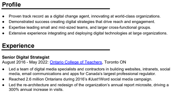
I dusted off my resume the other day. Seeing it again for the first time in years, I realized anyone looking at it might wonder why someone claiming design expertise had such a plain CV. There’s no colour, no exotic fonts, and the only decorations are horizontal rules and bullet points (if those count as decorations). From a design point of view, it’s as thrilling as burnt toast. Why would anyone create such a simple resume?
The answer is, because a resume’s three most important jobs have nothing to do with form and everything to do with function.

What your resume must do
Play nicely with the applicant tracking system
When you apply for a job, the first thing that happens to your resume is that it gets processed by an applicant tracking system (ATS), the software through which you apply. Some jobs still require you to manually enter key data (education, job history, skills, etc.). Often they don’t, relying on the software to do the job. That’s why the most important part of your resume isn’t how it looks, but how machine readable it is. The more elaborate the design, the more likely it is that the software parsing it will choke.
Increasingly, the ATS also recommends which resumes are good matches for a role. The hiring manager looks at those first, and sometimes none of the others. It’s easy to understand why: humans are busy people and don’t have the time or energy to examine every single resume in detail, especially when there are many roles to fill. That’s why your resume must be structured correctly and use a minimum of ornamentation that could throw off the ATS.
Be accessible
Most designers are at least passingly familiar with accessibility guidelines, but a knowledge of accessibility means more than simply being able to tick a box under a “skills” section. Assuming your resume makes it past the ATS, it’s going to be read by a human. Some of those humans may be blind, have low eyesight, colour blindness, cognitive disabilities, ADHD or other challenges. You need to think of them when drafting your resume.
From a purely professional point of view, accessibility is a must-have design skill. Demonstrating it can make the difference between landing a gig and pounding the pavement. If your resume can’t walk the accessibility walk, you’re doing your job prospects a disservice.
Be readable
Even if your resume looks fine on screen, there’s a good chance someone’s going to print it out. It needs to be as readable in print as it is on a device
What you need to do
I went above and beyond with my resume, because people expect a high degree of accessibility from someone with my background. My resume is WCAG 2.1 AA and PDF/UA compliant, which simply means it complies with international accessibility standards for PDFs.
Your resume doesn’t need to be that compliant. If you follow the suggestions below, you’ll be in good shape.
Use a consistent header structure.
-
- Do this:
- Header 1
- Header 2
- Header 3
- Header 2
- Header 3
- Header 3
- Header 4
- Header 2
- Header 1
- Don’t do this:
- Header 3
- Header 4
- Header 1
- Header 4
- Header 3
- Header 2
- Header 1
- Header 3
- Do this:
The first example lets software such as an ATS or a screen reader know that the content under Header 1 is the most important. The content under Header 2 is next in importance, and under that is something of tertiary importance, before we go back to a Header 2.
The second example jumps around from one heading level to another in an unpredictable and counterintuitive way, making it difficult for software to understand and navigate the PDF.
Sometimes people rely on how headers look to style their resume, even if that means those headers get placed in an illogical order. The good news is, you can modify headers in MS Word to look however you like, while retaining the correct structure. That means that you can set your resume up correctly in Word before converting it to a PDF.
Avoid using images to convey information*
Even if your audience reads your resume on a platform that has text recognition technology, that technology can choke.

* = Yes, I did the thing I just told you not to do, in the first image at the top of this story. Sometimes doing so is unavoidable or the alternative is impractical. In that case, do your best to describe the image with alt text. There are also ways you can convey this information outside of alt text. Ping me if you want to know more.
Don’t rely on colour alone to convey information
Software won’t recognize that text in a different colour means something different from ordinary black text, so don’t rely on colour to convey information or indicate subtleties in meaning.
Using colour to convey information also means that people with colour blindness might miss out on meaning, such as in the following colour combination, which is (barely) legible for most viewers:

…but which is practically illegible for people with the Tritanopia form of colour blindness. Below is how they’d see it:

Go easy on the decorations
Decorative elements that break the tag structure in the PDF make it difficult to parse.
Be conservative with fonts and colours
- Black text (or a dark shade of grey) on a white background exists for a reason: the contrast makes it easy to read.
- Arial is a great, safe font choice:
- It’s installed on most computers in the world, meaning it’s unlikely to be replaced with another font,*
- It’s sans-serif, which is easier than serif fonts to read in body copy.
- Never use calligraphic fonts on a resume. They’re notoriously hard to read, especially for people whose first alphabet isn’t the Roman one.
* = <techie alert> If you correctly subset your fonts in a PDF, this isn’t an issue 99% of the time. The other 1% of the time, things will go haywire in a way you can’t predict, and you’ll be glad you chose the most popular font in the world instead of Haettenschweiler, Bluefish Black Demo, Fahrvergnügen or something else.
White space is your friend
Adequate margins and white space make it easy to read text and locate landmarks on a printed page and on-screen.
Be careful how you save
Never, ever save a resume as an image in a PDF. Somehow this still happens. If you inadvertently create a PDF that’s actually an image, it’s inaccessible. The easiest way to find out, is to try to highlight individual pieces of text in the PDF. If you can’t, and you end up highlighting an entire page or more, that usually means it’s an image.
In parting
A resume is first and foremost information. Even a graphic designer’s resume needs to embody the person’s skills in information design, including usability, SEO (Search Engine Optimization) and accessibility.
Good design is info-centric. It acknowledges and embraces simplicity, cleanness, usability and accessibility. The best advertisement for your design skills is not to be the Mona Lisa of resumes but their Edward Tufte.
Happy job hunting.


